
What We Do
How We Do it
TRENDING TOPICS
Get in Touch
What's the easiest way to find out what your customers or potential customers want? Ask them. You can look at site traffic and behaviors, tweak, and rearrange all day long, but wouldn't it be easier to ask a direct question and get a direct answer? You see them all the time and sometimes you'll fill one out. Every submission is an insight into what someone is thinking at the time. Are they happy, frustrated, interested? Just ask them; that sounds easy. If it were that easy you wouldn't be reading an article about maximizing website engagement with forms. There's no silver bullet and there are countless "target markets." All you can do is optimize your forms to the best of your ability based on other's research and your own experiments. Below are a few things to keep in mind no matter what the form is trying to accomplish or who it's trying to target.
1. Fewer Fields
Any article regarding this topic will include a paragraph or two about the number of fields a form should have. The commonly accepted number of fields is 3 to 5. In general, this is true. If your company is trying to get off the ground or you're simply trying to increase leads you should trim forms to that field range. People are lazy and/or protective of their data so a 4 field form is less intimidating than a 25 field, 4 step form. It can be enticing to ask as many questions as possible in a contact form, but you'll be scaring people that may have otherwise filled out that form. Don't make the mistake thinking that this is your one and only opportunity to get that information. In addition to building a relationship with the lead, there are ways to make your form smarter about collecting data which we'll discuss later on.
2. Easier Questions
Even if your form is only 3 fields long if one of the fields is social security number no one is going to fill it out. Being strategic about the questions you ask is just as important as the number of questions you ask. Remember, having just an email address is better than having nothing at all. Social security number is an extreme example, but even requiring a phone number can be the difference between a submission and not. If the user wanted to talk to you on the phone then he/she would have done that in the first place, so a phone number is something you can get later on down the road.
Keeping all of that in mind, don't be afraid to ask questions that are specific to the end result of the form. If you have a "Get a Free Estimate" form it's perfectly fine to have a dropdown of the services you offer a textbox for the user to describe their situation.
3. Smarter Forms
As previously mentioned, your best bet of getting a user to fill out a form is having only a few fields. Part of the problem is that there are few "necessary" fields that take up most of your allotments like name and email. A potential client may fill out multiple forms before you speak to him/her directly. This is where smart forms can save you time and result in more qualified leads. Instead of asking a user the same questions over and over, with smart forms, you can "remember" a user and only ask questions that the user hasn't answered before. In this way, you can build a detailed profile on potential customers while also keeping your forms trimmed down to 3 to 5 fields.
As mentioned above, some fields can be scarier to users than others, but as he/she does more research and gets closer to the purchase decision in the buying process, he/she will be willing to give up more and more information. There's some degree of trust after an initial form submission that a user will feel so asking tougher questions will be less intimidating.
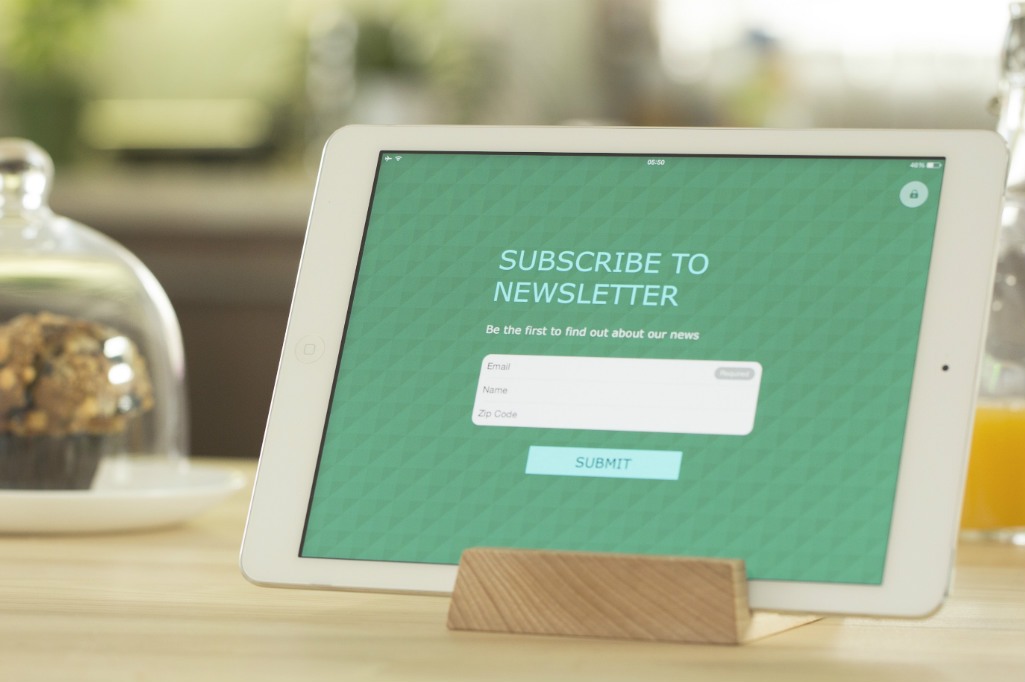
4. Better Buttons
A form submit button's label is "Submit" by default. Your button should never say "Submit." There's always an action that you can associate with the fields that are friendlier than "submit." Something like "Learn More," or "Get Your Estimate" is more inviting for the user. It's more task oriented. It mirrors how two people interact as opposed to a person interacting with a machine and we find that more comforting even if it's subconscious. This is one of the easiest optimizations you can make. All you have to do is change the label of your button based on what the form is doing for the user. There's no excuse to leave your button as "Submit."
5. Do it Again
Now that we've made our forms a little more user-friendly, what do we do with our thousands of submissions? We learn and improve. All the suggestions above you can accomplish without any feedback from your users. Once you get some feedback (feedback can be inferred by users NOT filling out your form as well) from your potential clientele, you can use that to make your form more focused on what they want. It's definitely a chicken and egg scenario, but at some point, you'll reach statistical significance and you can start to make informed decisions about the form. A/B testing is a great way to experiment with questions, button labels, etc. Optimizely is a great way to test your forms.
Make your website work for users-and look good doing it.
Similar Posts
Sign up for updates.
Powered by Caffeine + Cocktails
© Kicks Digital Marketing. All Rights Reserved. | Privacy Policy
Knowledge
Company
© Kicks Digital Marketing. All Rights Reserved. | Privacy Policy