At some point, you loved your branding. That shiny new logo and sexy font gave you butterflies in the stomach, but now that the honeymoon period is over you start to have a wandering eye.
When your branding loses its luster, you have two paths forward: full-fledged rebranding or a light brand refresh. Here’s the difference between the two, and a quick exercise to help you determine which one you need to take the next step for your branding.
What Is Rebranding?
Rebranding is what happens when good branding goes bad. Rather than building upon the previous branding elements, a rebranding project often starts from scratch because there’s not much good to salvage.
When a designer starts a rebranding project, it’s a great opportunity to flex our design muscles. We get to recontextualize the brand in new contexts that the previous branding doesn’t speak to at all.
The end result of rebranding is a brand-new logo, color palette, typeface, and other visual elements. It’s like looking in the mirror and seeing a completely new you — and trust me, it feels goooood.
Rebranding In Action
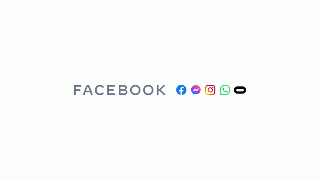
Remember when The Facebook Company changed its name to Meta? Along with the name change, Meta’s visual identity got a major rebranding, too.
First up we’ve got the new infinity logo, that speaks to the company’s plunge into the metaverse. It’s a mark that’s completely distinct from the original Facebook “F in a bubble” thing that recontextualizes them for the modern era.
Next up is the color palette. While the base infinity mark is similar to Facebook blue we’re all accustomed to, Meta has also shown off variants that pull in colors from the fully family of apps including Instagram and WhatsApp.
Last but not least, Meta is sticking with a custom typeface that they rolled out across their family of brands back in 2019. It turns out that typeface was just a sneak peek at the total rebranding project that took years to fully execute.

Source: Meta
What Is A Brand Refresh?
Compared to a full rebranding project, a brand refresh offers a lighter touch. Think of it as sending your brand to the spa rather than sending it to a plastic surgeon.
With a brand refresh, elements are updated rather than rebuilt from the ground up. It might involve a new logo that’s similar to your existing one but modernized, or a cleaner typeface, for example.
A brand refresh is a great option if you’ve got history with the logo and there’s more you like about it than you dislike. It gives you the opportunity to make changes but maintain the identity that you’ve got stake in.
Brand Refresh In Action
A great example of a brand refresh is our work with Deskimate, a virtual claims partner for insurance adjusters.
Deskimate has a positive reputation in their industry and recognizable branding that they have a stake in. They were a natural choice for a brand refresh to keep what’s working about their visual identity and revitalize it.
Our first step was to settle on a modern color palette. We settled with a turquoise that invokes the secure feelings of blue and the wealth implications of green — which makes perfect sense for an insurance company.
The next step was to bring Deskimate’s logo in line with their sister company’s branding. The sister company’s logo was thicker and bolder than Deskimate’s, lending legibility and confidence that Deskimate’s logo lacked. Our refresh helped Deskimate get its logo groove back.
The overall result is branding that keeps the embedded value of Deskimate’s legacy while bringing it up to the current year.
Do I Need Rebranding Or A Brand Refresh?
That’s a pretty subjective question, but you can answer it yourself without too much trouble.
Make a list: what do you like about your current branding? Put a Love column on the left and a Hate column on the right, then have an honest chat with yourself and your team.
If the “Love” column turns out longer than the “Hate” column, you probably want a brand refresh. A brand refresh will emphasize what you like about your current branding, and tidy up some of the elements you aren’t particularly fond of.
If the “Hate” column is longer, it’s probably a sign that rebranding is the right path forward. It’s an opportunity to start with a clean slate and reimagine your brand for the modern day.
Whether you need a rebranding or a brand refresh, outside perspective always helps. The branding bosses at Kicks can help you take the next step forward. Learn more about our process and see some of our proudest branding wins by tapping the button below.
The average person spends nearly 20 hours a week on social media. How does yours rank?
Similar Posts
Sign up for updates.

Powered by Caffeine + Cocktails
© Kicks Digital Marketing. All Rights Reserved. | Privacy Policy
Knowledge
Company
© Kicks Digital Marketing. All Rights Reserved. | Privacy Policy


